When a user experience is a good one -it’s seamless. You don’t even realize how smooth your experience has been unless you look back and really think on it. A bad user experience on the other hand … Well, let’s just stay those stick with you. They can get your blood boiling or give you a horrible taste in your mouth towards a certain company, app, business, etc. that just won’t go away. I’ve decided to develop a series of articles about bad user experience, because when you’ve had enough you’ve had enough. App developers, pay attention to this one, I promise you that a bad user experience will go a long way into ruining things for everyone. Let’s fix this before it goes too far.
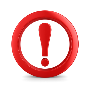
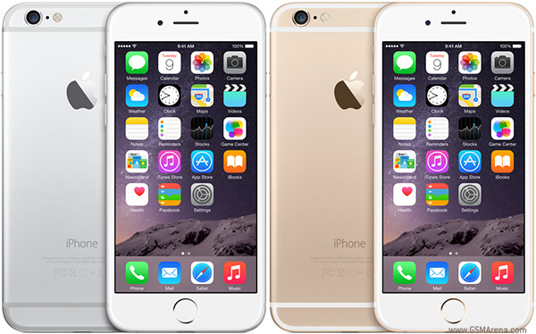
Just because an application, product, or program has a great user interface doesn’t mean that the user experience will automatically be great. It’s a balance of both and each are equally important to the success of the product. An example? Phantom Red Circles. What is that you ask? Well, Phantom Red Circles is when an app wants your attention. Take Shazam for example. This app sends out news stories and creates an alert icon (red circles) that demand your attention. I rarely use the app as it is so why do I have to go in to read their news stories? Stop with the phantom notifications application designers! Also, give us ways to stop being notified for other minor things. Flipboard is another example. I think Flipboard is great; however, it notifies me every time someone subscribes to a magazine I created. Nice. Thanks? Honestly though? It’s too much and enough is enough.
Instagram is one that will send a notification alert to your phone if people have been posting photos lately. Really Instagram? What else would people be doing on Instagram other than posting photos? I’ll find out about them when I go into the app and poke around. I didn’t subscribe to each person I follow to be front page news on my phone. It isn’t necessary.
It’s one thing if I’m actually going in to the application to let me know little things, but to bring them up on my phone as a little alert is too much. Facebook doesn’t notify you to your phone when someone ‘likes’ a picture you’ve posted, only when they comment on it, other apps need to take note. I want notifications for the things that are important to me. Not the things that are important to you that you think should be important to me. Get it?
The user interface on these apps is completely fine, but the bad user experience associated with them overshadows that. It’s not necessary to make users jump through hoops for something they don’t need or care to now. Bottom line, don’t put your news feed in my news feed.
These are exactly the reasons why you want to be engaging with someone who deals with developing applications. There are tons of people who have ideas and want to develop applications. Most times, it’s necessary to bring in a custom application development consultant to catch the little annoyances like this that will absolutely drive your customers away.
Anyone having other user experience annoyances right now? An app that won’t leave you be? Something similar in android or windows? Comment below!

