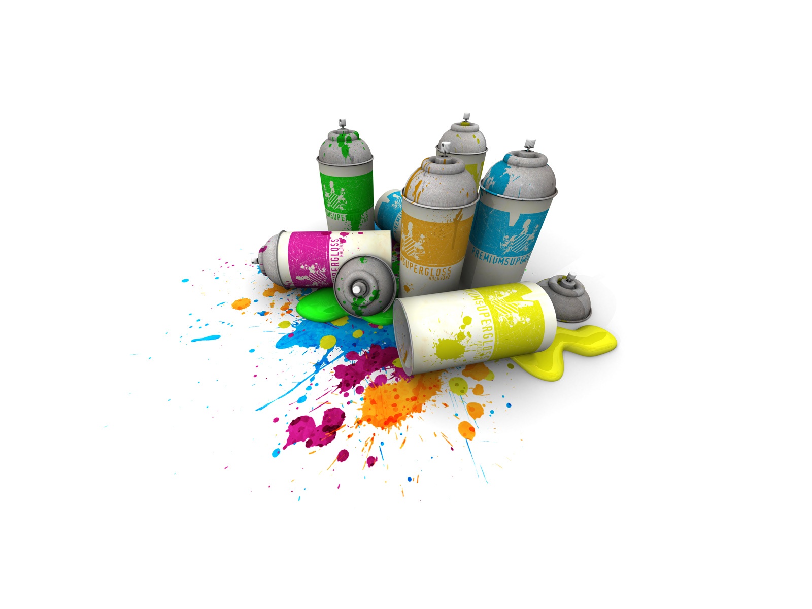
When creating your company branding, the logo plays a very important role to grab the attention of the customers. You must understand that your company logo plays a significant role in defining your overall brand identity. This is why it needs to be designed properly before being released. If you want to create a winning logo design, play with colors and excite customers. Colors have a great effect on the psyche of the customers. Design of the logo can be made bright and strong by the help of application of warm and cool colors.
This article will help you to choose the best color for the logo of your company.
Red
Red is generally appealing, energetic and powerful color for the logo of your brand. Red logos grab the attention of your customers and, if you want to attract the target market, use red color for your logo. The red color is associated with passions like anger, excitement, danger and adventure. Therefore an instant connection can be created with the customers. They become amazed and excited about the use of the color red. Red is mostly used by the food brands. However, if you want to your push your clients to take conclusive actions and trigger strong association without the fear of highlight objectionable emotions, this could be the best color for your brand.
Yellow
Yellow is the color of happiness, fun, innovation and creative thinking. Yellow generates festive vibes and is action-oriented without any passionate connotations. Yellow is naturally a bright color so you will certainly find that it induces more of the happy emotions than any other colors. Mostly, it doesn’t play a central role in the logo but cautiously highlights the important features of a logo. If you want to communicate joy, be sure to use this sunny color in your logo. The yellow color is commonly used by automobiles and food industries.
Orange
The shades of orange can cover an extensive range of emotions but one that stands out among them all is boldness. Orange color desires to grab your attention and it wants to play. These qualities make it perfect for fun and joyful logos. Orange would be a good color for a business that is bold but supplies innocent services such as toys, daycares, vacations, etc. Moreover, if you are thinking about opening a software company, orange has the power to show your customers that you are on the front-lines of new and latest technologies.
Blue
Blue is the classic king of colors. This color is used in corporate logos to create a sense of security while showing loyalty and professionalism. A lighter blue evokes more trustworthiness while dark blue evokes the presence of intelligence. Both are good but it is important to decide which is more likely to get the customer through the door. This color is used by various businesses related to finance, pharmaceutical industry, software, governments, and banks.
Purple
Big brands adopt purple color as it shows royalty, mystery, and luxury. It is prominent in areas like fashion, interior designing, and as well as in industry. Purple is the combination of red and blue so it has both warm and cool properties. Purple is not the color that will appeal to everybody but it still attracts a certain business that is looking to distinguish itself as unique. Business who deals with high-class niches such as jewelry, luxury cars, or beauty could have some success with purple. It can certainly inspire respect towards the brand.
Green
Green is a great color for stress-relief but it shows some negative meaning like over-possession and materialism. It is the common color because of the association with nature, and in turn with life, peace, growth, income and wealth. Green color reflects freshness and harmony. Green color features a finely balanced combination it is not as proactive as red, not as violent as yellow and not as calm as blue. If you are looking to reflect harmony and peace you can choose this color as the logo of your brand. The green color is mainly used to reflect eco-friendly companies and businesses which are evolving around agriculture, recycling, gardening and solar power.
Pink
Pink represents feminism, youth and beauty. This color is usually used in logos related to beauty, fashion and others. As this color is playful and innocent it is not appropriate for the corporate or industrial unit. The pink color is also widely related to breast cancer awareness. It is often used in logos to add feminism flare. Companies which deal in children’s clothing and accessories use pink color to attract children.
Black and White
Black represents elegance, sophistication, and class. The black color is often seen in logo who wants to represent power. If you brand caters to an audience who wants to feel secretive, black is a great color for your brand and white is the universal color of purity. For use in media, many logos will require a black and white form in which color is not available and presently there is a trend of bold colorless logos and wordmarks.
Final Words…
Colors play an important role in giving life to your logo. Use various shades and experiment different colors to give essence to your logo. It is very important to create a lively design which embodies the product or service properly. The appearance of logo plays an important role in attracting the people in order to purchase a product for the first time.
Martin Roy is professionally working as a logo designer and digital media marketer in a logo design company. With many years of experience in branding and design. He is passionate about learning and sharing knowledge about logo design and its impact on companies and organizations.


